Libby
Visual Language Expansion
Packaging Design | Illustration
Collaborators
Amanda Perez, Creative Director
Year
2026
Libby had an established visual foundation, but the illustration system needed to feel more distinctive and ownable. The goal was to introduce a sense of movement and personality without losing the clarity of the existing packaging system.
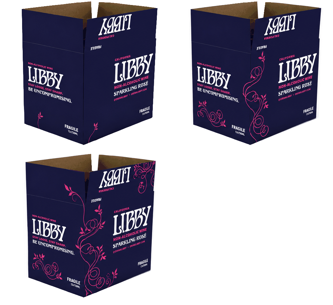
The ChallengeWorking with Creative Director Amanda Perez, I helped develop a cleaner, more directional illustration style that could bring greater energy and personality to the brand while remaining cohesive with the existing packaging system.
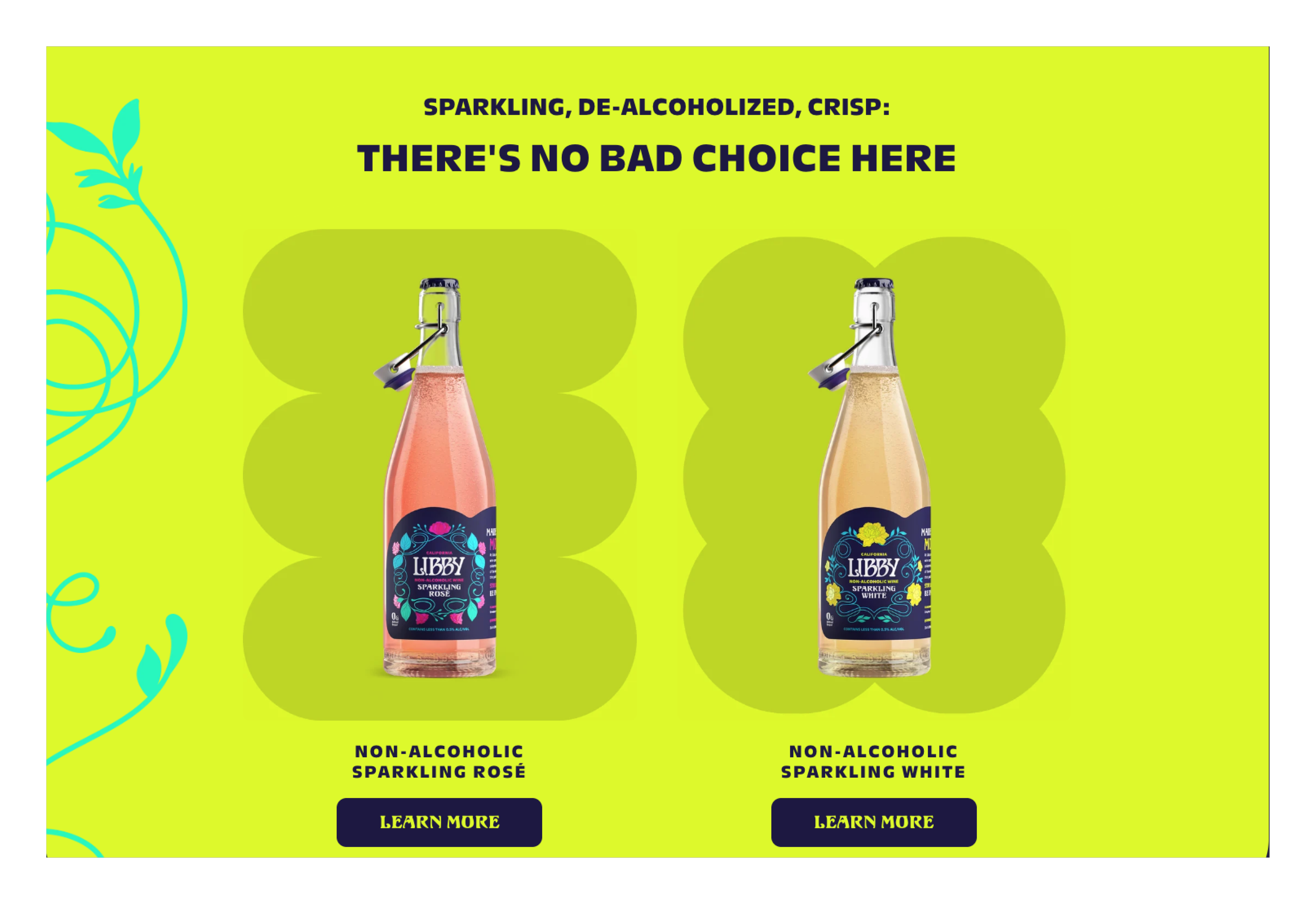
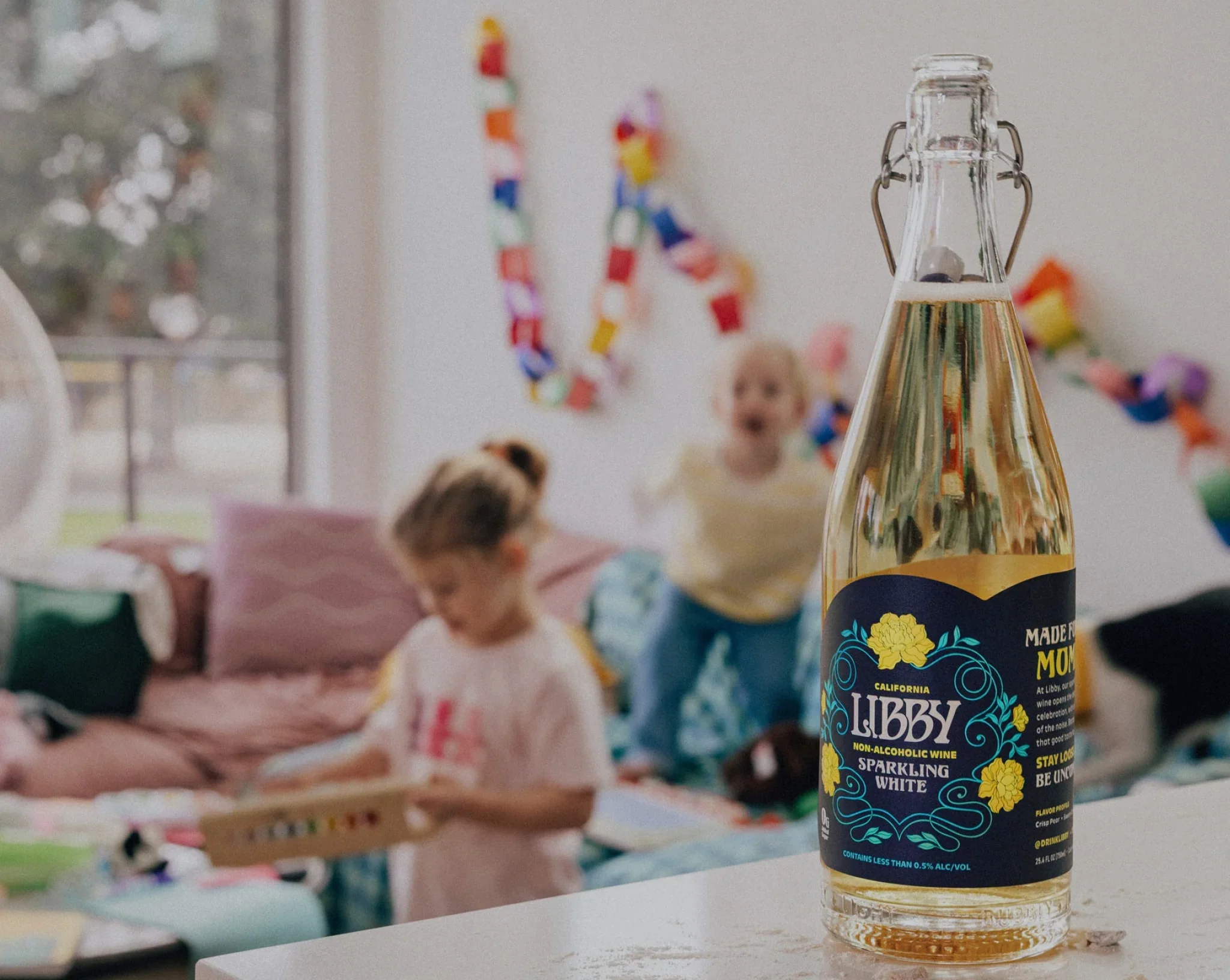
The work focused on creating a flexible visual language that could extend across packaging, refining individual illustrations and ensuring they worked cohesively with the existing typography, composition, and label architecture.


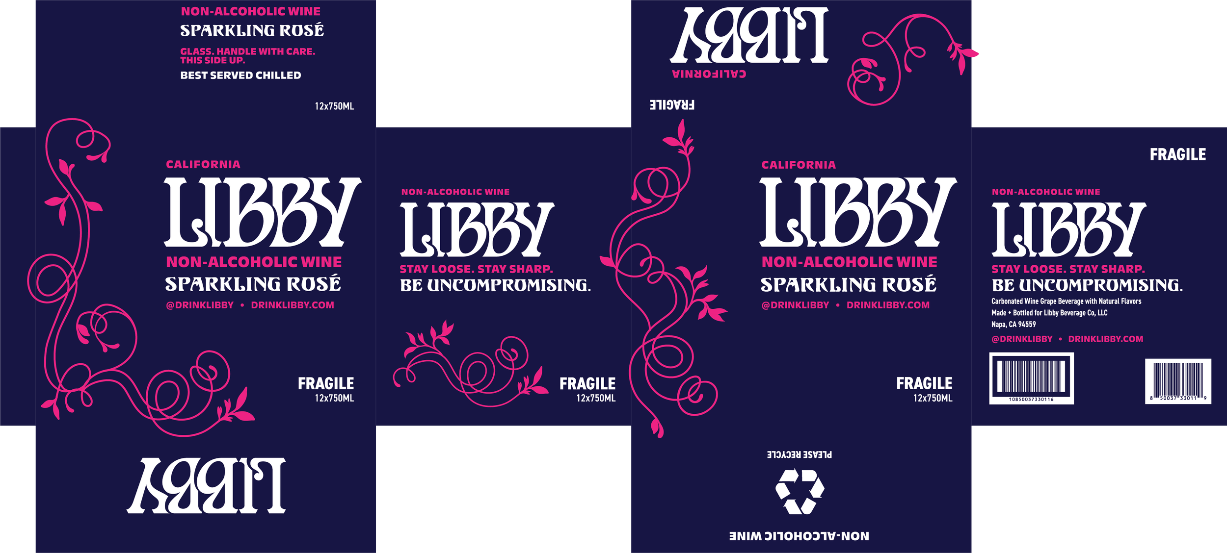


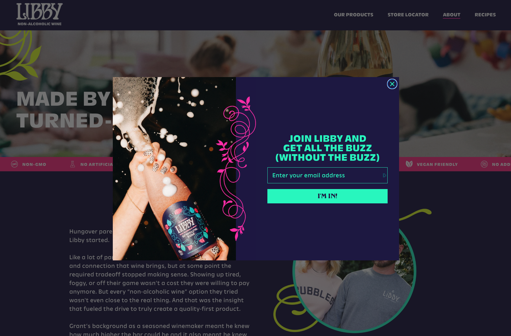
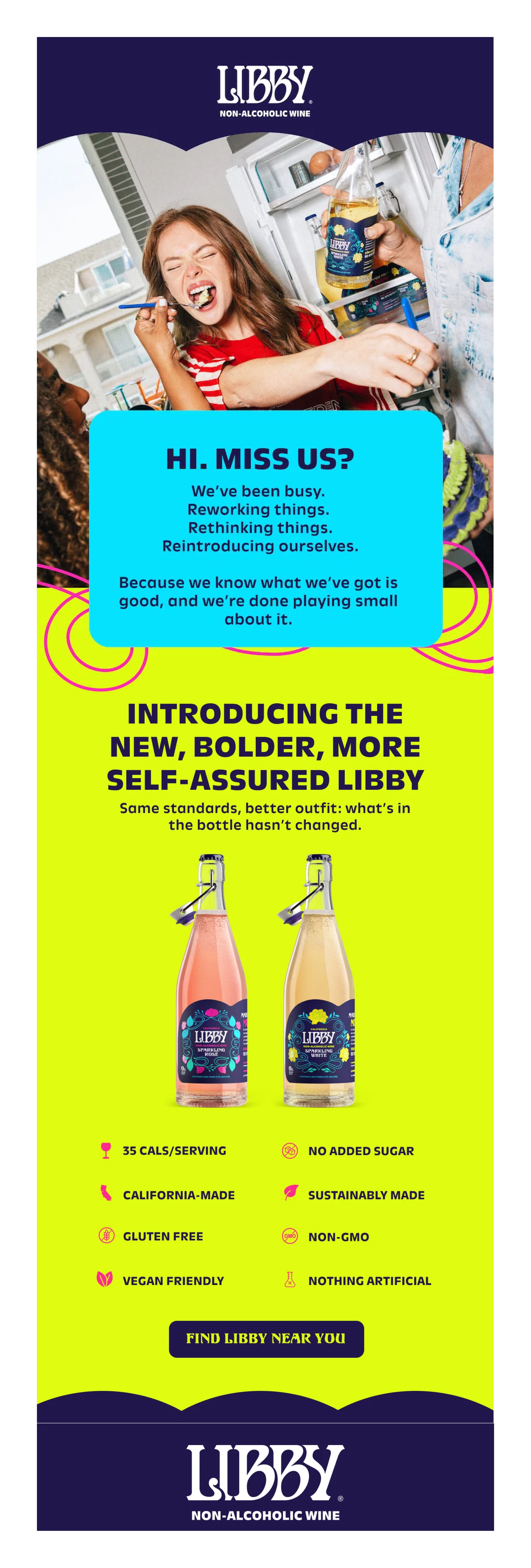
The ProjectThe magic isn’t in the ornament. It’s in motion. These elements inject human energy into the system and help to visually emphasize that Libby isn't just another non-alc one-off, we know what we’ve got is good, and we’re done playing small about it.
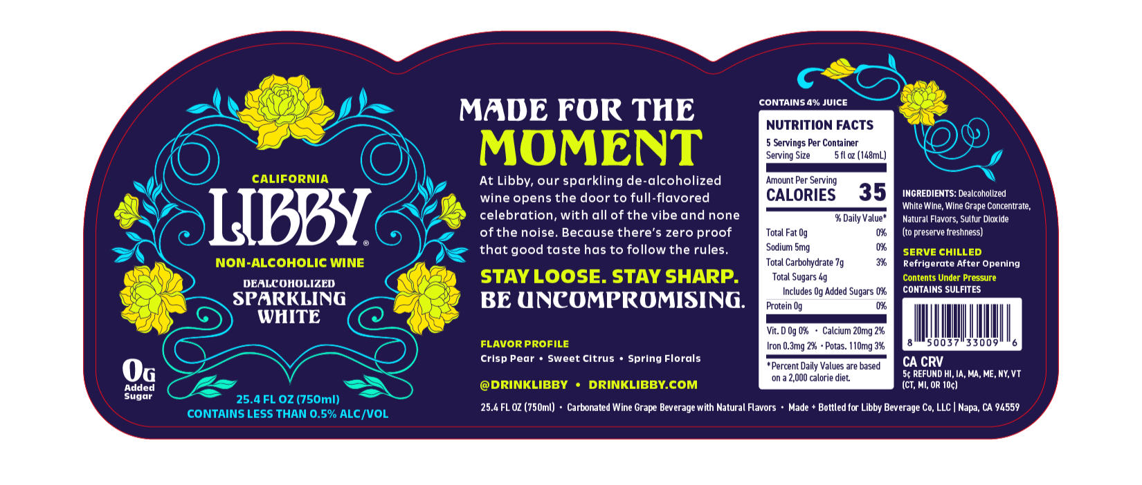
The Illustration SystemThe illustration system was designed to extend beyond the package, creating a cohesive visual language across both physical and digital touchpoints. From packaging to web, the illustrations bring added personality and movement to the brand while maintaining a consistent, recognizable expression.